Graphic Design and Marketing
TASK
Design the visual identity of an editorial publication by transforming a personal concept into a cohesive magazine system. The project required creating a cover and back cover, a table of contents, and multiple articles of varying lengths, while ensuring consistent typography, composition, and art direction throughout. The challenge was to establish a strong conceptual foundation and reflect it in both print and digital formats.
DELIVERY
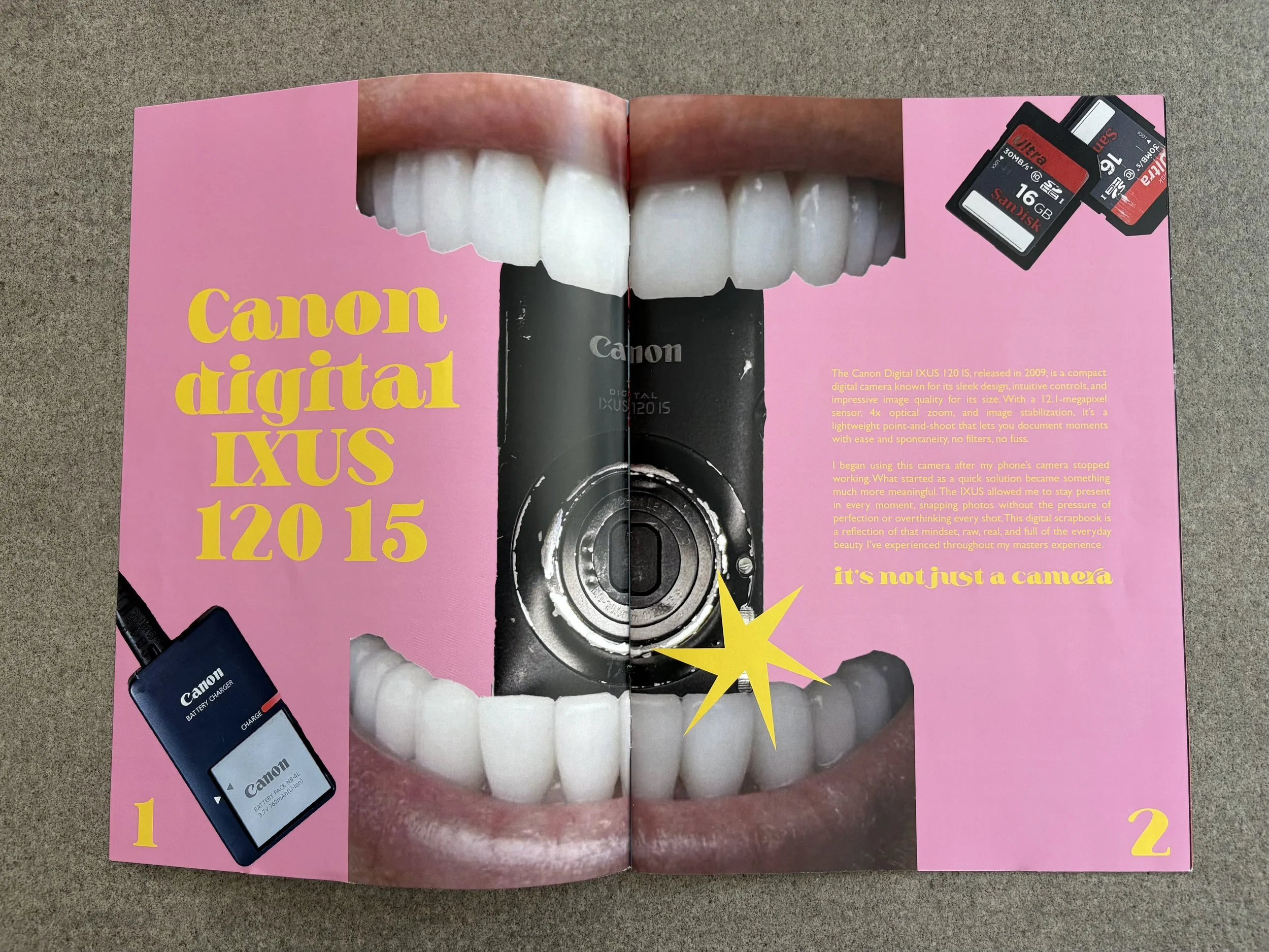
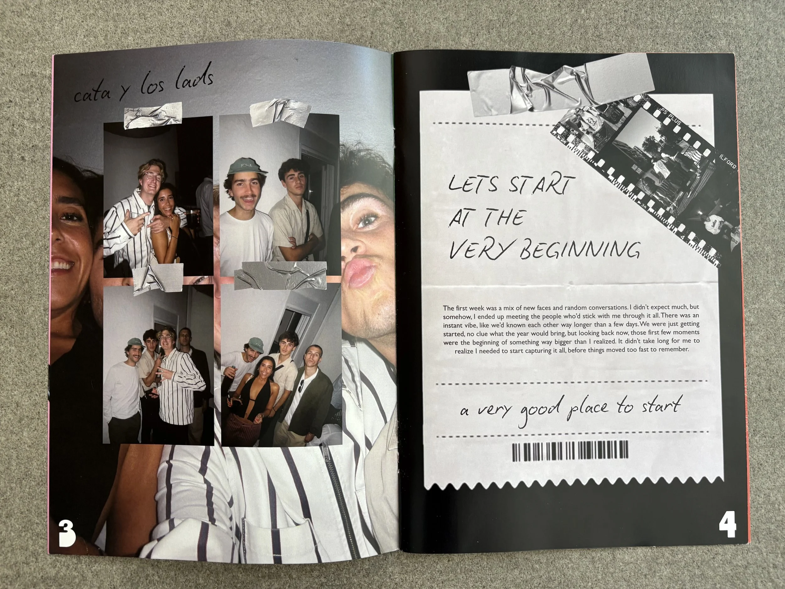
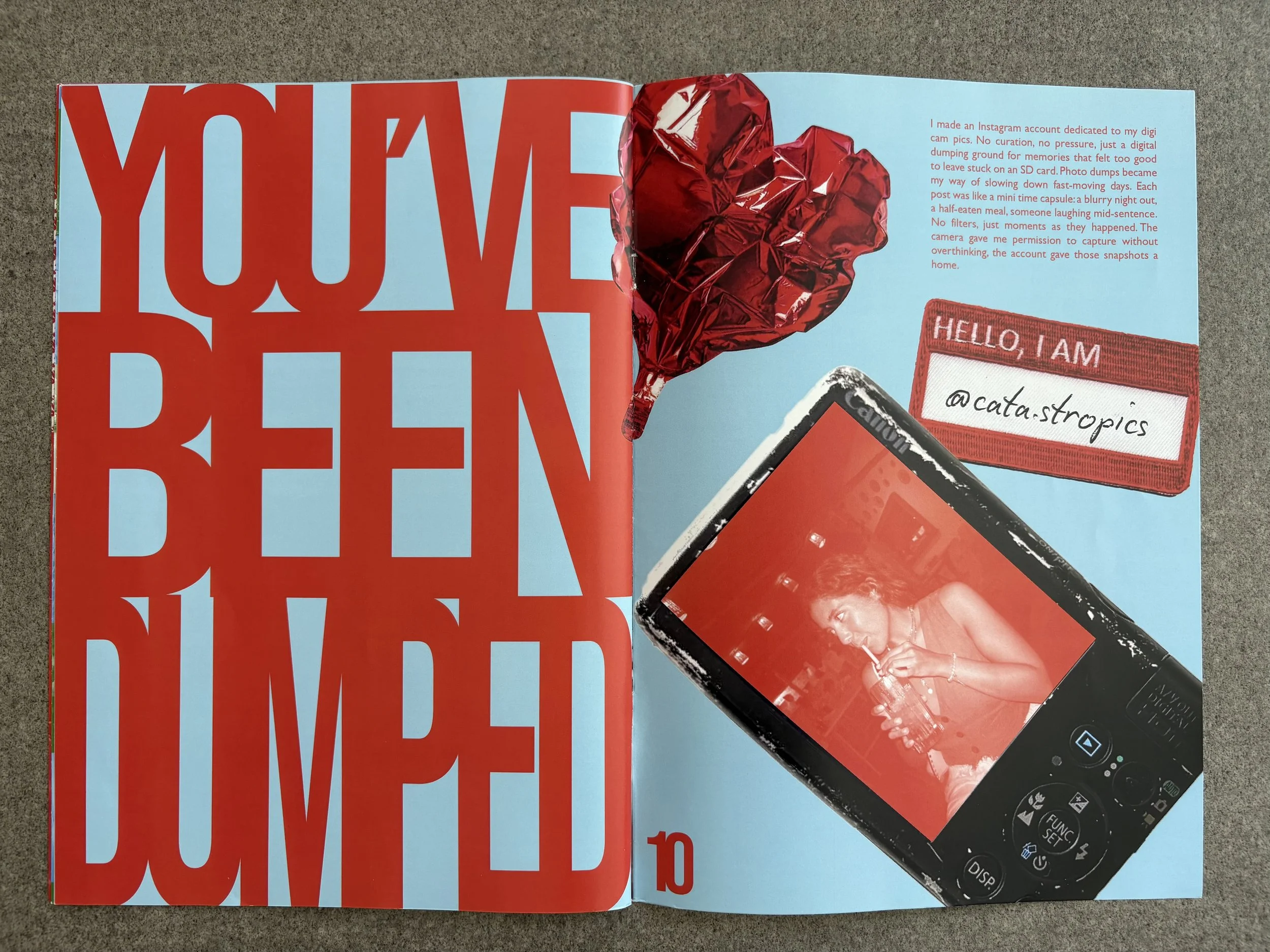
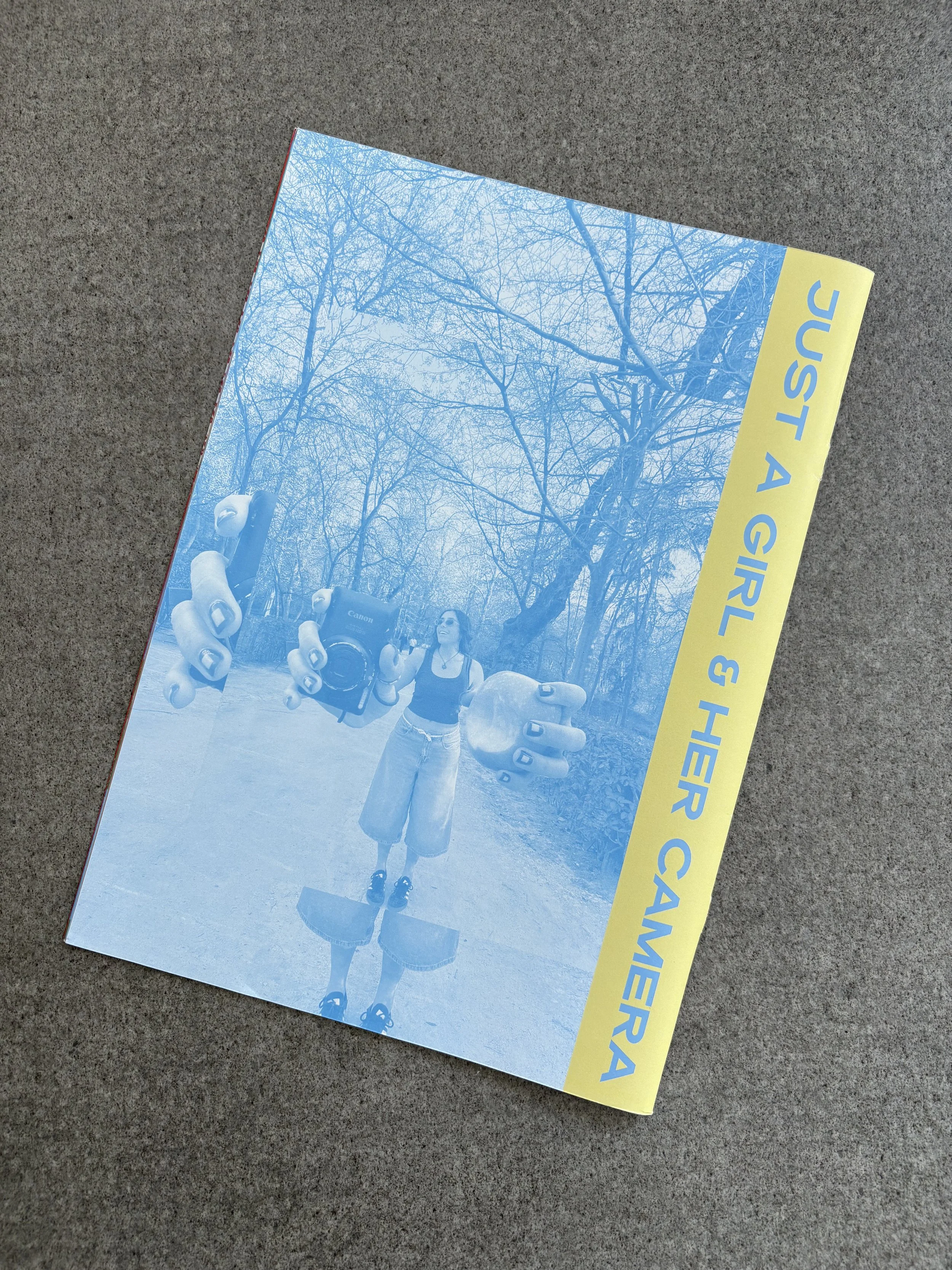
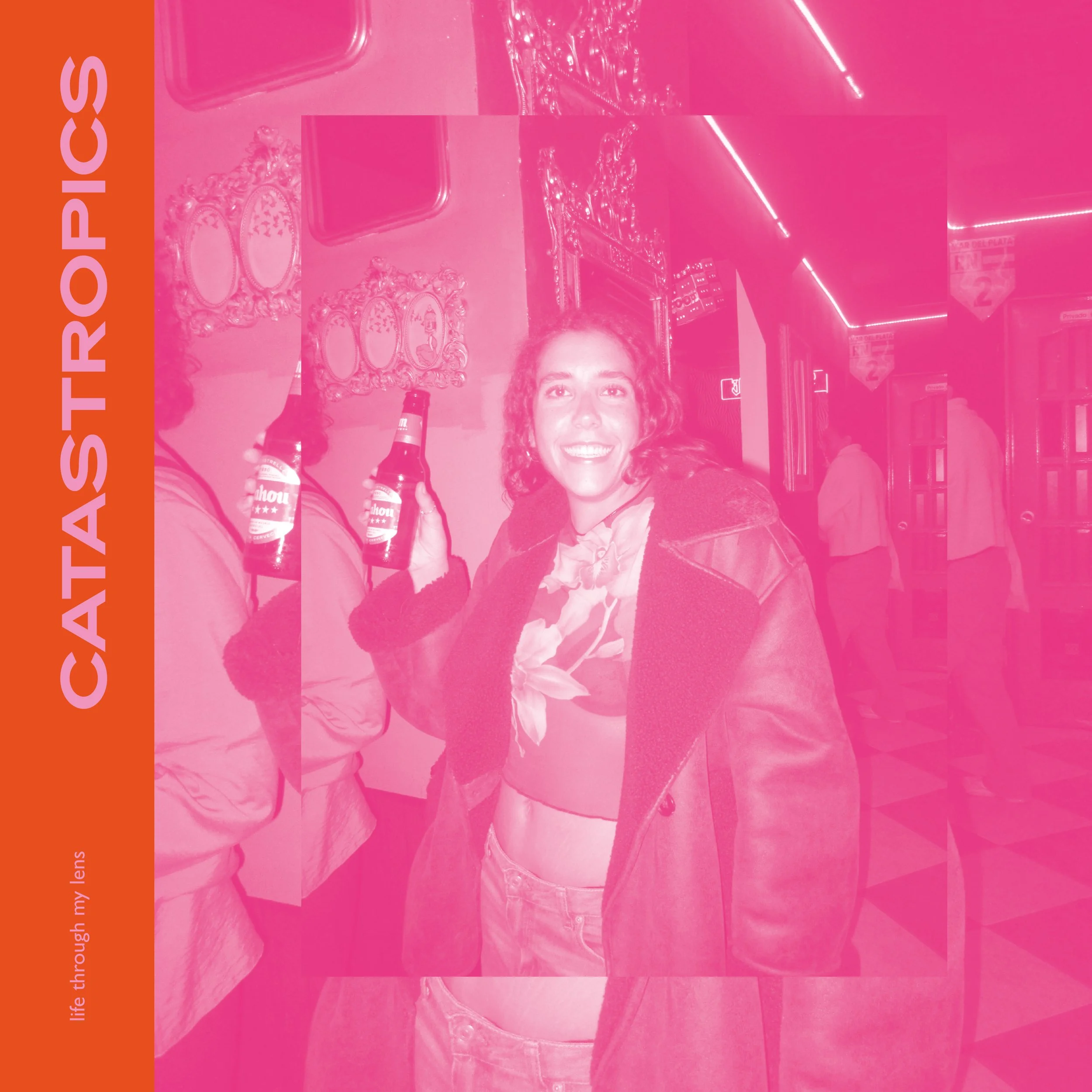
I created Catastropics, a magazine inspired by the idea of capturing fleeting, unfiltered moments through the lens of a compact digital camera. The visual identity blends playful typography, bold color palettes, and collage style layouts to echo the raw, candid aesthetic of digital “photo dumps.” I combined intimate photography with expressive type treatments, balancing narrative driven spreads with experimental compositions. Each design choice, from the oversized titles to the fragmented photo grids, was meant to reflect the spontaneity, humor, and honesty of lived experiences. The result is a publication that feels both personal and energetic, showcasing a cohesive editorial system while celebrating storytelling through image and design.
TASK
The project involved rebranding an existing music festival to appeal to a completely new and contrasting audience. This included researching the festival’s current identity, defining key personality traits, and developing a refreshed visual direction tailored to the new target. We created mood boards and applied the new branding across various touchpoints, including a lineup poster, merchandise, social media assets, food truck design, and packaging. Resulting in a cohesive and reimagined festival experience.
DELIVERY
I rebranded Tomorrowland with a nostalgic, analog-inspired identity to connect with an older, more reflective audience. Centered around the theme “Back to the Roots,” the design draws from 60s/70s counterculture and Woodstock-era aesthetics, warm, communal, and timeless. Using retro typography, sun-faded colors, hand-drawn elements, and vintage crowd imagery, the final poster captures a soulful, tactile vibe that feels both authentic and emotionally resonant.
TASK
Designing and producing a vector-based poster concept for a band or movie of choice. Responsible for the full creative process from defining the visual style, color and typography palettes to laying out key information such as title, artists/ actors, and director. The project also included adapting the design to multiple formats.
DELIVERY
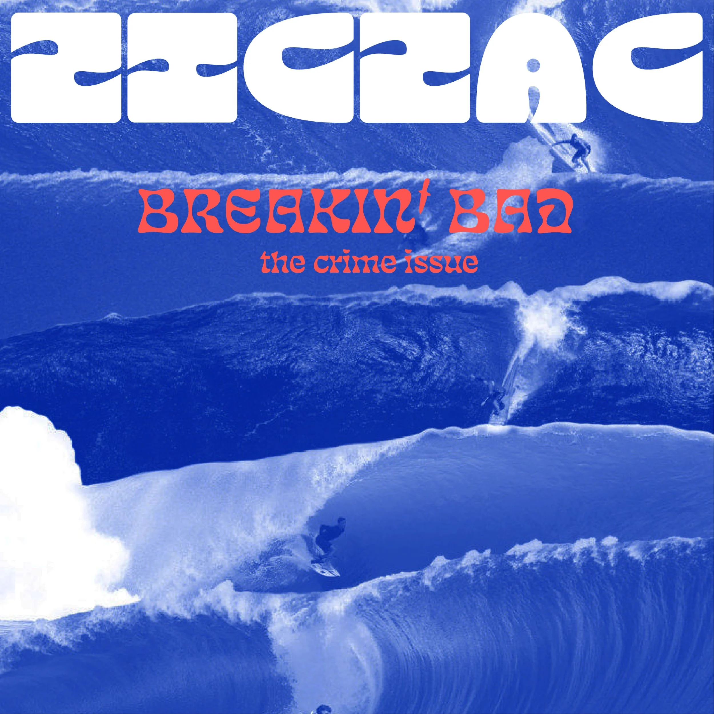
I chose the movie Chasing Mavericks and brought its spirit to life through a bold, vector based poster design. Inspired by the film’s themes of resilience and the raw power of the ocean, I developed a clean, dynamic illustration style using Adobe Illustrator. I focused on capturing the energy of big wave surfing through simplified shapes, vibrant color contrasts, and a carefully curated type palette.
TASK
Design a modular typographic system and develop a complete alphabet including numbers. Define the foundational modules, establish metrics and variables, and create promotional pieces that demonstrate the system’s adaptability. The project required a fully designed presentation covering the rules of the system and its creative applications, with each team member responsible for producing one promotional piece.
DELIVERY
I developed a modular typeface inspired by geometric forms and the fluidity of surf culture. Starting from simple, repeatable shapes, I constructed a full alphabet and numerical set that balanced boldness with rhythm. I explored scalability and versatility by applying the type system across different promotional pieces, including a soda can design, stickers, and a magazine cover. To reinforce consistency, I defined a cohesive color palette and typographic rules that carried across applications. My promotional piece, a magazine cover, showcased how the modular system could adapt to editorial design while maintaining its distinct identity.
TASK
Tasked with creating a conceptual still image advertising campaign for Levi’s, the objective was to reposition the brand from an American icon to a global symbol of innovation.The campaign targeted digital nomads and modern youth, exploring themes of rebellion, digital culture, and freedom. A key requirement was the integration of AI-generated backgrounds to visually support the futuristic and boundary pushing narrative, aligning with the lifestyle of a globally connected generation.
DELIVERY
Working as a group, we developed a conceptual ad campaign for Levi’s that spotlighted sustainability, positioning the brand as a long lasting, eco-conscious alternative to fast fashion. Using AI generated imagery, we placed wild animals in urban settings to symbolize nature reclaiming space and to highlight the environmental impact of overconsumption. We shot models in-studio wearing Levi’s denim, then as the lead designer I used Photoshop to seamlessly blend the products onto the animals in post production.
https://www.facebook.com/cachacaaluarez
https://www.instagram.com/cachacaaluarez/
https://www.linkedin.com/company/aluarez/
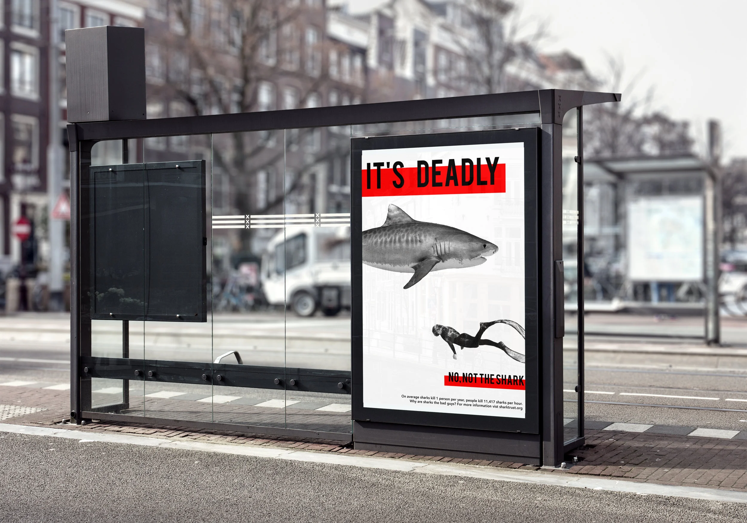
Problem: People see sharks as killing machines
Solution: Demonstrate how non threatening sharks are by comparing them to seemingly harmless animals
Art Direction/Copy Writing: Catarina Moreira-Rato & Manuela Angrisano
This campaign won a silver bowl at the Hatch Awards 2019:
https://www.bu.edu/articles/2019/hatch-award-student-winners/
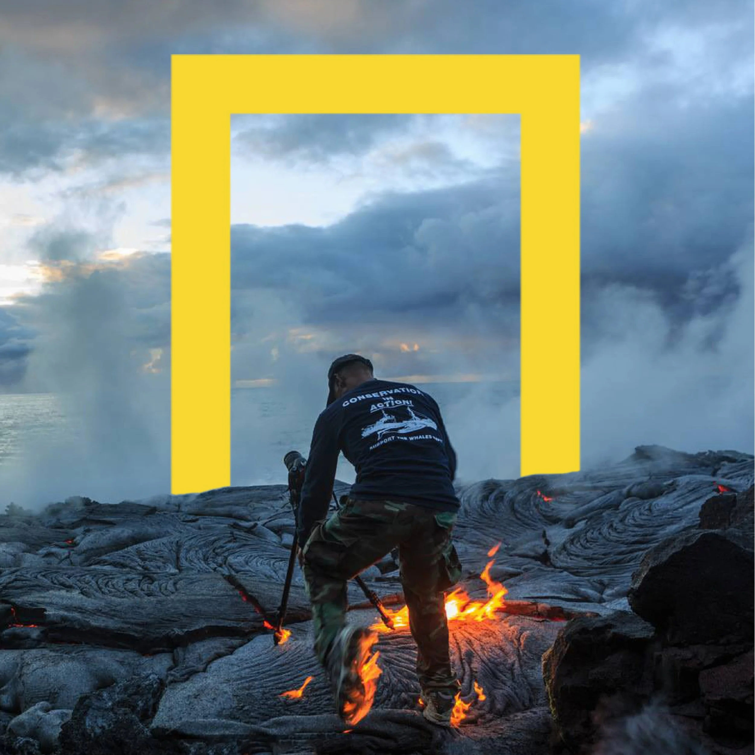
Problem: We want to raise awareness about the dedication it takes our staff to get the perfect shot.
Solution: Show what it takes to get the perfect shot.
We reached out to many current National Geographic photographers, and got responses from Gordon Wiltsie and Cary Wolinsky, to get a sense of their experiences in the field.
Art Direction/Copy writing: Catarina Moreira-Rato & Manuela Angrisano
Problem: Even loyal CVS customers throw away the receipts without looking at the coupons on them.
Solution: Create an app called Carework where you can scan your coupons onto your phone and trade them for ones you might be more interested in.
Art Direction: Catarina Moreira-Rato
Copy Writing: Abigail Waters